jueves, 11 de junio de 2015

Me Designer

Concept:

The following poster runs four pillars: personal vision, creation, composition and modeling of new virtual worlds as a reference the environment and atmosphere in which we live daily. A 3D artist always is guided by the study of behavior of living things in order to give a touch of realism, fluidity and quality in the area that performs the human being , by modeling, texturing, animation, lighting, composition and rendering.
In the poster I see myself like a 3D artist whose background base is represented by rounded shapes and that also shows the natural world. On a second level there are five pillars representing departments for a 3D project concluded: Modelation, animation, texturing, lighting and rendering . These five pillars give the feel of a hand that is manipulating the object located at the top.
Finally, on the third level you will find a six sided polygon (hexagon) in 3D which means the recreation of virtual world from just polygons. the Color management will work with the theory of analogous colors as a result of a low contrast. The range is handled in three colors: 2 shades of green tint one being a neutral color, while the other represents the natural environment plus the blue tint that represents the virtual environment.

Gustavo A. Parra C.
5326
Design Principles B


viernes, 8 de mayo de 2015

Postcard Design

First Phase

MindMap:


Second Phase

Concept:

The topic selected is the fourth classical elements in nature, those are Earth, Air, Fire and Water. During the application of Gestalt principles of continuity and closure, morphological figures representing each element were recreated. 

Attempt I


Element: Air.
Animal: Owl.
Using the couple of letters 'C' and 'O'.


Element: Air.
Animal: Butterfly.
Using the couple of letters 'C' and 'i'


Element: Earth.
Animal: Snail.
Using as couple the letters 'J' and 'D'


Element: Water/Aqua.
Animal: Octopus.
Using as couple the letters 'S' and 'Q'.
Gestal Concept: Figure and Ground.

Attempt II:

Animal: Sort of accuatic animal with tentacles.


Experimenting with the letters 'S' and 'V' concept of figure and ground (negative space) to create a kind of Eastern Dragon.
Element: Fire.


Re-structuring the composition according to the task: 


Analysis Opposite couple letters.
Some of them share are alike to each other just they change orientation, rotation or reflection.

Colour selection: 

It was selected according to general idea that represents each element and it was decided play with analogous palette to keep the same vibrations in each postcard, therefore, the supportive colour comes from the shades of one colour dominant and the neutral colour is close to black but belongs to the correspondent colour palette.

Composition:

In the process of morphological recreations, they were selected 2 opposites letters:

Final Result


First postcard “J and L” to recreate a insect shape.
Element: Earth. Colour: Green Scale.


Element: Air. Colour: Blue tints.
Second postcard the letters were “q and p”, in this case generates a sort of butterfly.


Third postcard: “S and Z” were selected to represent a fight between two fire Eastern (oriental) Dragons.
Element: Earth. Colour: Red Scale


Fourth postcard: Letters H and I allow the recreation of a Manta ray or Devil fish.
Element: Water. Colour: Blue Scale.

viernes, 24 de abril de 2015

Assessment: Application of Colour Theory.

Assessment: Application of Colour Theory.


Primary Colours:

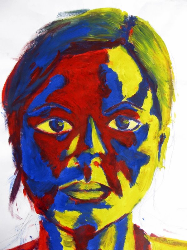
Blue, Red and Yellow are colours really intense therefore, it is common to use them in small concentrated areas in a composition and also mixed with neutral colours such as grayscale ones.


          Application in interior design.                                                  Recreation of lighting and shading. 

Secondary Colours

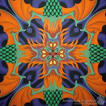
These colours are Green (combination of Blue and Yellow), Orange (derivation of Yellow and Red) and Purple (composed by Blue and Red), 


Photography                                                                          Artwork

Tertiary Colours

These colours are created when it combines one primary colour with a secondary colour therefore, exist 8 colour types.


Digital images                                                                              Photography

Analogous Colours

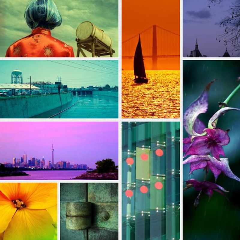
These sort of colours are next to each other to the right and and also to the left side in the colour-wheel. Usually, they are using to play from warm to cold temperature and vice versa.


Photography                                                                                                      Painting

Complementary Colours:

Colours in front or opposite to each other in the colour wheel. For instance, Orange colour corresponds the purple one.


Painting                                                                                               Photography

Split Complementary Colours:

This kind of colour application happens when choosing a colour the two complementary colours to choose are those ones being in both sides of the original complementary colour. For instance, choosing Orange the two complementary colours are those that are to the both sides of the Purple one, in this case Blue-Green and Blue-Violet.


Artwork Design                                                                                     Interior Design

Note:

All the images used as a reference have been founded in Google search engine using key words as Primary colours examples, Secondary colours examples, Tertiary colours composition, Analogous colours designs and Complementary colours compositions.

martes, 21 de abril de 2015

The Gestalt Principles - Graphic Design


Closure


This happens when some objects are group together but not joined to each other to build a new figure.


Continuation

This concept explains that some objects can be placed to recreate kind of way and at the end viewer finds something to catch their attention.


Figure and Ground


When a ground space allows to perceive a figure due to the sorrounding area. The relation created between figure and ground has the idea to recreate the entrance from one dimension to another one.


Multistability


This concept has the capacity of play with the mind of the viewer due to the fact that a figure can take two kinds of shapes according to the perspective of the person, in this case can be seeing a cube or 2 rhombuses.


Proximity


When some objects are placed close, it can be 
identified as a group.


Reification


The idea consist in suggest to the viewer that exist a object in the background that is locked out by figures.

viernes, 3 de abril de 2015

M.C. Escher, a Dutch graphic artist. Analysis By Gustavo Parra


Title: Rind (1955)

Specifications: Wood engraving and woodcut in black, brown, blue-grey and grey, printed from 4 blocks. 235mm x 345mm.

This artwork by Escher obtained my attention because the different elements and concepts with wich he is playing:

Continuation Concept: 

It is the first one that come to mind due to the fact that the viewer just has to follow the sort of path of the profile head. It does not have a point of start defined therefore, from the bottom to the top is also possible to do it. The effect in the audience is really impressive due to the unique way to explore the concept of 4th field or dimension, allowing the viewer takes the action to re-build the figure visually.

Closure Concept:

The process of reconstruction is possible because of the way as Escher placed the long "reddish tape" and giving the trims to play with the negative space however, he is keeping the shape.

Title: Tetrahedral Planetoide (1954)

Specifications: Woodcut in green and black, printed from 2 blocks. 430mm x 430mm.

Due to the level of complexity I chose to analyse it.

Figure and Ground:

It is possible notice how some figures are pointing to each side of the boundaries (in this case screen) as a expansion movement while on the other hand, some figures are collapsing as a negative space.

Closure:

Also this artwork allows to witness of how a tetrahedron as a main figure that contains a subgroup of geometrical shapes.

Reification:

In the image, multi-perception is the key of composition. Additionally of the previous descriptions, a perception of sort of face can be see; but bearing in mind the vanishing points composition is the clue to understand this Gestalt concept..

Escher Motivation Video.


Escher At Work from M.C. Escher on Vimeo.

REFERENCES:

The Official M.C. Escher Website
This website is published by the M.C. Escher Foundation and The M.C. Escher Company B.V. in Baarn, the Netherlands. The site is available in both English and Dutch.

Version 5.0 - Last updated: December 31, 2013

Images:

1) Mcescher.com,. 'M.C. Escher – Rind'. N.p., 2015. Web. 13 June 2015.
2) Mcescher.com,. 'M.C. Escher – Tetrahedral Planetoide'. N.p., 2015. Web. 13 June 2015.

martes, 31 de marzo de 2015

Font Design: Diagonish 7180

The Concept


Alphabet Font Result


 Process of design


Creation of golden section (orange areas) and guide lines (blue colour).

Software used Adobe Illustrator CC 2014


Poster


This image shows the process of creation of the font DiagoNISH 7180 starting with the circle and getting its radius until obtain the golden section when it started the geometrical ray-tracing and the guide lines to build the area for each letter.


martes, 17 de marzo de 2015

Fonts Research

Fonts I like:

NOTE: I used the sentence “Xcorpion Tav0 6” to test the capital and lowercase letters also numbers to analyse the style of each typography. Reference color used was: R:18 G:90 B:97

1) Dento designed by foxh0und
Free version font for personal use only.
Reference: http://fontmeme.com/deus-ex-font/


2) Drive by Iconian Fonts
Free version font for personal use only.
Reference: http://www.dafont.com/drive.font?back=author


3) SF Chaerilidae Oblique by ShyFoundry.
Free version font for personal use only.
Reference: http://fontmeme.com/incubus-font/


Review: I really found marvelous the serif fonts due to the aesthetic details no only in letters also in numbers and symbols. The first two instances are geometrical design that combined 45 and 90 degrees cuts with some round shapes. The Dento font was used in the video game Deus Ex: Human Revolution. The last sample called SF Chaerilidae Oblique is a sans serif typography with slight roundness and also oblique lines to break the stereotype of using just vertical and horizontal lines to built a sans serif typography as it can see in letter "a". This font has been used the USA rock band Incubus to create its logotype.


Fonts I dislike:

1) Survivor Series designed by Jayde Garrow
Free version font for personal use only.
Reference: http://fontmeme.com/survivor-series-font/


2) Angelique ma douce colombe by Maelle.K | T.B
Free version font for personal use only.
Reference: http://www.dafont.com/angelique-ma-douce-colombe.font?back=theme


3) But you can get fucked by Elizabeth Marino
Free version font for personal use only.
Reference: http://www.dafont.com/but-you-can-get-fucked.font?back=new


Review: The main reason to belong to the group of dislike is the lack of clarity to read the viewer ought to guess the sentence. A second reason is because these typographies do not respect the space rule among letters, as you can see in the fonts Survivor Series and But you can get fucked.

The Survivor Series font is a nice try to combine bold and shocking sans serif typography nevertheless the mistake between the letters “i” and “o” in the word “Xcorpion” is critical if you need to print a poster then colors will mix.
The Angelique ma douce colombe font has a cursive italics style however it is no difference between “a” and ”o” letters therefore it creates an interpretation conflict to viewer.
Finally, the last font is But you can get fucked from my point of view the only positive aspect is the originality because the functionality is almost null is just a group of scrawl. This typography does not follow any design rules and to complete, it does not have the total group of letters and numbers.